
We find so much benefit in visual models to help us think about agile testing and spur conversations with our team. Over the years, we have come across many, that have helped us have a conversation with our teams. In Part One of this two-part blog series, we will share some ways to visualize quality that we learned from Rob Meaney and Dan Ashby.
This first visualization we show you is one that Rob tweeted about a few years ago. Each time his team saw a test fail or found a bug, they wrote it on a sticky note and mapped it against a Y axis that indicated their level of understanding of the cause, and an X axis that indicated on whom it had the most impact.
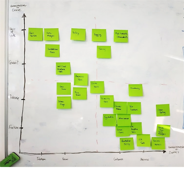
For example, when a unit test failed, the test was specific to one small area of the code, so the cause was easily understood. It impacted the programmers who committed the change that caused the failure – they needed to fix the test. That placed unit tests at the top left of the map.
An example at the other end of the impact and understanding scale is when the team discovered, via their production analytics techniques on the bottom right of the map, that the conversion rate of free trial customers converting to paid subscriptions has decreased by a large percentage. They didn’t understand the cause immediately or its impact to the business. The team saw increased error rates in their analytics. Their release flagging technique, in the lower left of the diagram, could give clues as to which change might have started causing problems. They could look at logs, using the logging techniques represented in the diagram at the top in the middle, to see what the errors look like.
All these techniques helped them zero in on the area of the code where the problem was, so they could investigate and fix. They moved from knowing the impact of an issue to identifying its cause. Shortening this process meant they could recover quickly from failures.
Rob explained that the big takeaway from this diagram was that the team focused their efforts in the top right: building techniques that allow them to understand both impact and cause at the same time. They used techniques such as high cardinality observability - for example, having full data about a specific event performed by a specific user.
As the testing coach, Rob asked the team questions to help them deepen their understanding of problems and find ways to address them. What should always be true? What should never be true? Thinking about these helped developers evaluate whether the new change they were about to check in would behave as desired, and whether it might break some other part of the app.
The team explored quality attributes like data integrity, and how these contribute to their ability to understand problems and assess their impact. They found new ways to monitor data about production use and trigger appropriate alerts. They experimented with techniques to shorten feedback loops to avoid negative impacts on customers or the business.
The visual map doesn’t solve problems, but it helps the team find ways to better understand failures and their impacts. We have found that the first step to identifying and solving a problem is to make it visible! We encourage teams to use this idea to develop their own way of visualizing problems as a way to start improving.